Aster & Oak
A botanical skincare identity built on restraint, warmth, and a wordmark that breathes.
- Client
- Aster & Oak
- Role
- Identity, Art Direction
- Category
- Brand Identity
- Year
- 2025
Overview
Aster & Oak makes small-batch skincare from foraged botanicals. They arrived with a beautiful product and a brand that looked like everyone else on the shelf. The goal was a identity that felt apothecary-grade without tipping into cliche.
The challenge
The category is crowded with soft serifs and sage greens. Aster & Oak needed to signal craft and trust while standing apart from the wellness sameness, and it had to scale from a 30ml bottle to a shopfront.
The approach
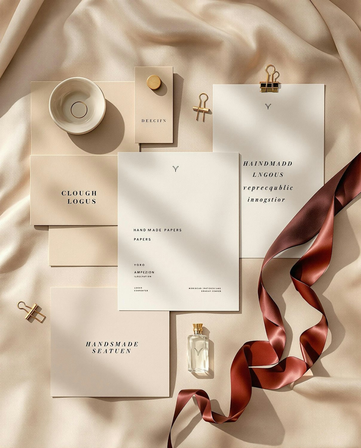
I built the system around a custom wordmark with a single botanical ligature, a restrained palette of clay and bone, and a flexible grid that lets each product tell its own story. Every element was drawn to survive the shrink down to a label.
- Brand strategy & naming refinement
- Custom wordmark & monogram
- Colour & typographic system
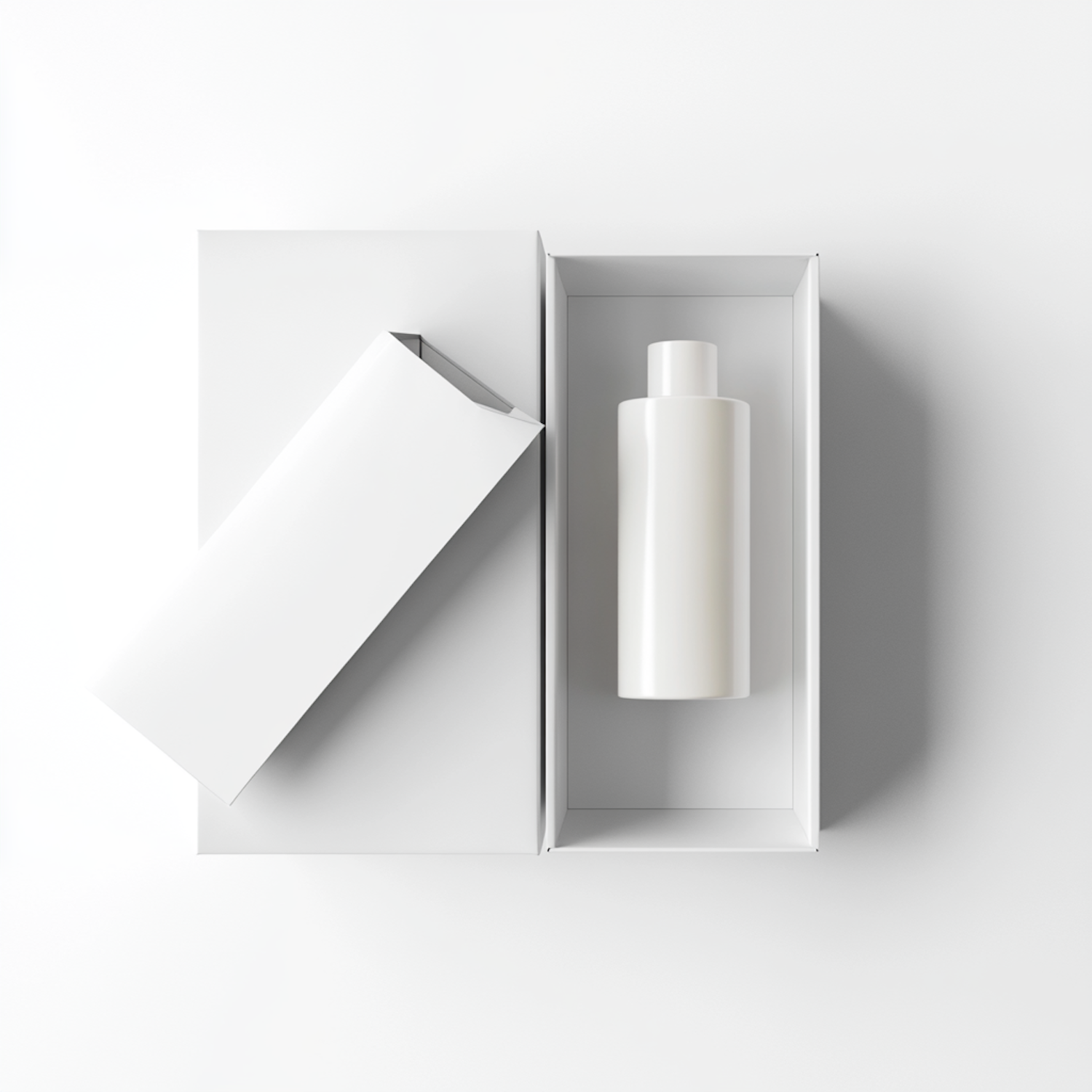
- Packaging & label design
- Brand guidelines

Outcomes
3x
Retail listings
+41%
Repeat purchase
9 days
Launch sell-through
